Are these GUI button icons clear?
SP4CEBAR 2021-11-01 07:35 (Edited)
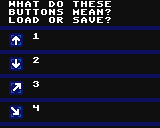
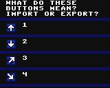
I made a little survey with 4 icons from my old piano roll and my new piano roll labeled with a number each, each icon either means load a file or save a file. Please let me know in a comment which icon you think would load a file and which icon would save a file.
The first two are the very unclear icons from my old piano roll, the second two are the improved icons for my second piano roll, are they any better?
(Open the upper program attached to this post)
was8bit 2021-11-01 10:10 (Edited)
I would lean towards how Timo has his icons ... an arrow pointing towards (save) or an arrow pointing away from (load) a file, the file could be as simple as a side view (a line)
I use this approach in my sheet music editor i am working on...
was8bit 2021-11-01 10:13
Also, If you pair connected controls together, it can help identify their functions..
SP4CEBAR 2021-11-01 11:05 (Edited)
I'm trying to make stylish icons, but they usually end up getting not that clear.
The first two icons are so unclear that even I get confused every time I use them.
The idea behind the new (last two) icons is that the box is the program, and the arrow shows whether it imports or exports the file.
The reason of this survey is to figure out if other people see the box as referring to the program or to the disk (which inverts their interpretation)
Quote: "Also, If you pair connected controls together, it can help identify their functions..
True, that's been left out for this experiment
was8bit 2021-11-01 13:31
Hopefully others will offer their thoughts :)
nousername010 2021-11-02 09:00
Hm, personally I think it's better if you decrease the size of the arrows a bit and add a line or small letter to indicate what you want to mean.
That said, the up and down arrows work fine as save and load judging from their position in the piano roll editor, although it can be a clearer with a horizontal line on the bottom. For import and export, better left and right arrows with a small letter E on them.
Of course, this is just my opinion. Feel free to do what you want with my 2 cents :)
Timo 2021-11-03 07:14
I also think it should be clearer that the arrow points into the box or out of the box. But then be careful that it doesn’t look like the iOS share button…
SP4CEBAR 2021-11-03 09:34
Thanks for all the feedback!
SP4CEBAR 2021-11-03 09:47 (Edited)
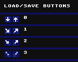
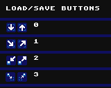
I designed a few new load/save button icons, I think the last pair can't be misinterpreted
was8bit 2021-11-04 04:13
I kinda think having the box with the disk is distracting...
How about my #2 :)
SP4CEBAR 2021-11-04 17:18 (Edited)
Yeah, that could work, but I think I'm going to go for the last pair of icons
was8bit 2021-11-05 04:36
They work fine too :)


