Wolf 3D User Poll
nathanielbabiak 2022-10-27 01:41 (Edited)
I've experimented with three different display systems for ray casting. It's getting to the point that I need to commit to a single display system to finish the 3D objects that will allow the space to feel alive.
If you run each of these links, I'd like some feedback on the question at the bottom. Please share your thoughts!
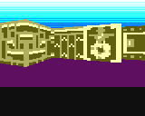
- #1 uses fewer colors, and the pixels are tinier (2x1)
- This attachment is an updated version of #1, better for comparison
- (Please don't consider #2. It's not possible to extend this engine for 3D objects.)
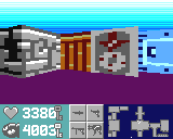
- #3 uses many colors, but the pixels are blocky and really wide (4x1)
Please try to ignore the in-motion effects shown in #1 (the jitter when you turn/run close to a wall). It's a clumsy way to optimize performance, and won't be in the next upload if we pick the display system of #1.
Also, I've added quite a few features over the years, so please pretend that textures/doors/map/HUD/sound features from #3 will be in the next update. (The skybox horizon sprites shown in #1 will not be in the next update.)
Lastly, the differences #1 vs. #3 regarding the simple patterns shown on the sky and floor are not part of the display system. Those would be modified on a per-level basis to suit some artistic feel. (No need to commit at the moment!)
Do you have any preferences in this "trade-off" between colors and block size?
was8bit 2022-10-27 04:16 (Edited)
Cheerful games should have lots of colors... I would go as far as saying monotone would be suitable for a wolf game...
... personally a Lara Croft game would be more up my alley ;)
Cheems 2022-10-27 05:57
I’ll have to say that although I find #3 extremely impressive and would love to see a faithful demake of wolfenstein, I had more fun moving around in #1 due to how easy it was to recognize edges of walls/corners and openings
Timo 2022-10-27 10:07
I also prefer #1, because of its clearer image. I guess the textures can still be improved a bit? How do they work?
nathanielbabiak 2022-10-27 14:03 (Edited)
In #1, I just hadn’t implemented UV texture mapping, instead I had used a bunch of If-Then statements to approximate it. It could really only do straight lines. UV tex mapping isn’t any slower than my If-Thens though.
Sounds like the graphic borders (“picture frame” style) of #1 is preferred then, since borders are so easy to see? (#2 does something similar.) In #3, I got rid of the borders, and tried varying the colors a bit for walls facing East-West vs. North-South, at the edges it was supposed to help. Is that less visible than #1?
nathanielbabiak 2022-10-27 14:10 (Edited)
Textures will actually be *faster* than my If-Then statements once the 1992 optimizations are included. In mine, two neighboring vertical strips of the same (or similar) pixel patterns get recalculated. In the ‘92 version, the second would just be copied over.
nathanielbabiak 2022-10-27 16:27 (Edited)
Cheems,
Thank you - I appreciate the complement!
A while back I posted that a demake would be possible, but it’s looking like CPU constraints will limit the objects in-game to 2 or 3 at most (and 32x32 px for each, rather than full-size). So for #3, I just picked a map that everyone would be most familiar with. I won’t be able to do a decent demake, the system’s just not fast enough
GAMELEGEND 2022-10-28 01:30 (Edited)
I also like #1 better because #1 is just easier for my crappy eyes to look at and the movement in #1 seems better than #3.
nathanielbabiak 2022-10-31 14:35 (Edited)
I finally understand what y'all mean about #1 being clearer!
(It's not so much that #1 uses a 2x1 pixel block display system, where as #3 uses a 4x1 pixel block display system.)
It's more-so that every block in #1 is always mapped to the correct texture. #3 doesn't always map to the correct texture. Instead, neighboring blocks are sometimes copied (when the software determines it wouldn't compromise visual quality too much).
It's just for speed, since texture mapping is slow. (I had hoped nobody would notice!) Seems that geometric patterns (rather than texture maps) are preferred.
More to come...
nathanielbabiak 2022-11-01 05:54 (Edited)
I've attached a better version of #1. Let me know what you think! This attachment is just a work-in-progress. You can see the screen render from left-to-right (it's not buffered yet), please try to ignore the left-right rendering!
I am considering visibility, high-contrast, etc... I do want it to be easy to see. The original #1 used a form of vector graphics, which are super-visible, but also super-cumbersome to work with. Raster graphics (i.e., textures) are much easier from a game-design perspective (although much slower to render!)
To make the attachment or #3 easier on your eyes, you can go into the source code and uncomment line 54, you can find the line in the iOS editor by searching for "3.999".
Another thing I'm experimenting with is high-contrast textures for the attachment, like in this video. In #3, you can see the palette variation in east-west and north-south walls, but I suppose that wasn't high-contrast enough.
More to come...
was8bit 2022-11-01 08:36
Seems abit confusing... how about trying each wall just being a plain wall with a simple darker border .... keep doors and such as is...
McPepic 2022-11-01 22:27
@nathanielbabiak For some reason, doors aren't openable from certain directions in this demo.
nathanielbabiak 2022-11-01 22:38 (Edited)
You're both right - the attachment has two issues:
- textures are to "busy" and look like video noise (there's a reason houses in the real world aren't decorated with checkerboard wallpaper!)
- the game engine is broken, doors don't work
I didn't address these issues. (I just just wanted to keep talking about the display.) I like that it provides an exact comparison between the two screenshots.
nathanielbabiak 2022-11-01 22:49 (Edited)
All that said, this poll has been really helpful.
(I test this rendering so often that I can't see the forest through the trees anymore! I didn't realize the video noise was so noticeable by everybody.)
The next version of the system will limit the 3D panel colors to a single palette (3 colors), but make use of the higher resolution of the attachment.
...It'll also have some new surprises...
More to come!
was8bit 2022-11-02 04:14
:)